Behind the design / 00
Open form.
The idea behind the identity of my personal website.
Leave room for an idea.
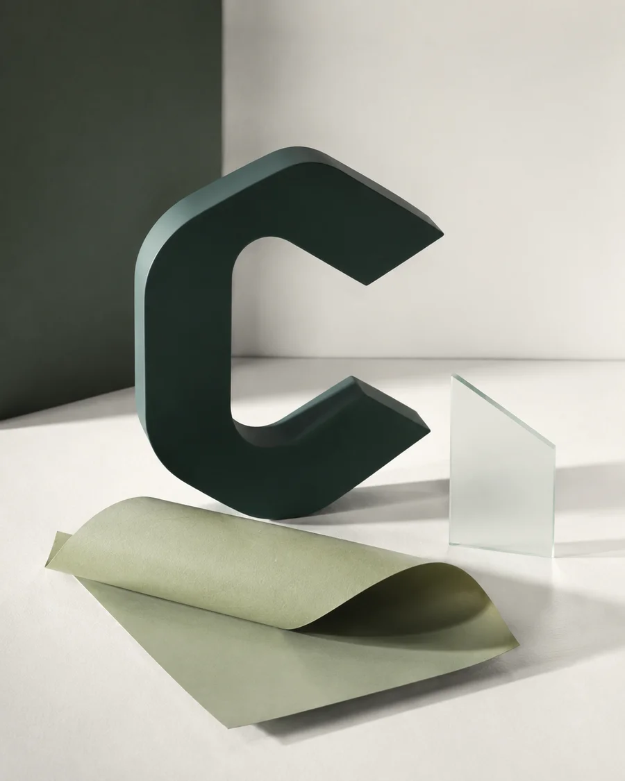
This is my website: a place for my writing, the work I do, and things I make. The identity gives those different pieces a shared home. The open C comes from Congar, the name on this site.
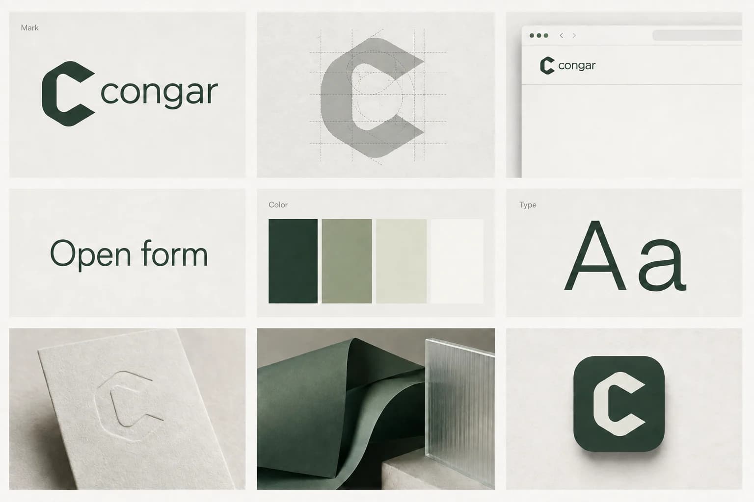
I call the identity Open Form. The mark stays open; the pages leave space for the work. These chapters explain the logo, the visual choices, and how they fit a website with more than one thing to say.
The current identity is documented here. The explanations describe the choices in this website, rather than rules every website should follow.
Take a closer look.
01A letter with room inside.
Read the mark, inspect its details, and see how the original brief became a usable logo.
A few choices, used consistently.
Try the colors and type. See how paper, glass and green forms connect the images.
A website you can work with.
See how writing, work, and personal products share one home without becoming the same thing.
Take the identity into your next project.
A complete brief with colors, typography, assets and motion rules. Read it, share it, or copy it into your coding conversation.
Elsewhere on this website
Now try a direction of your own.
a different set of choices, yours