The project guide / 04
Take the identity
into your next idea.
The choices behind this website, written down for the next project. Share this page or paste the complete brief into your coding conversation.
Copy once. Add your project requirements, then paste both into your conversation.

A shared starting point.
A practical reference for carrying the Congar identity into a new project: clear typography, paper surfaces, deep green actions, and motion that explains what changed.
#17231fHeadings and the main reading color.
#263e33Filled controls with paper-colored text.
#839779Supporting shapes and quiet accents.
#e0e6d4A secondary surface for visual studies.
#f6f7f2The page background and breathing room.
#53604fDescriptions and supporting copy on paper.
Use it in a project
Bring a brief of your own.
Tell your model what you are building, who it is for, and the stack you want to use. Include this guide as the visual reference. Keep the product's own content and workflows.
The Markdown file contains the whole guide, including exact values and asset links. Paste it directly when your tool cannot open websites.
Start with the product
Use this guide when building a project for Mohammed Abdelhady. Congar is his personal identity; Open Form is its open C mark. Keep the product’s own purpose, name, and audience clear. A tool can belong to this family without becoming a personal homepage.
Use the new project’s own name and content. Keep Mohammed’s biography on his personal pages. Describe only verified work; never invent experience, clients, metrics, or availability.
Give the content room
Build the hierarchy around a useful action and understandable content. Use generous margins, deliberate alignment, and restrained separators. Give headings, reading text, and supporting notes distinct roles. Compose small screens deliberately; do not shrink a desktop canvas.
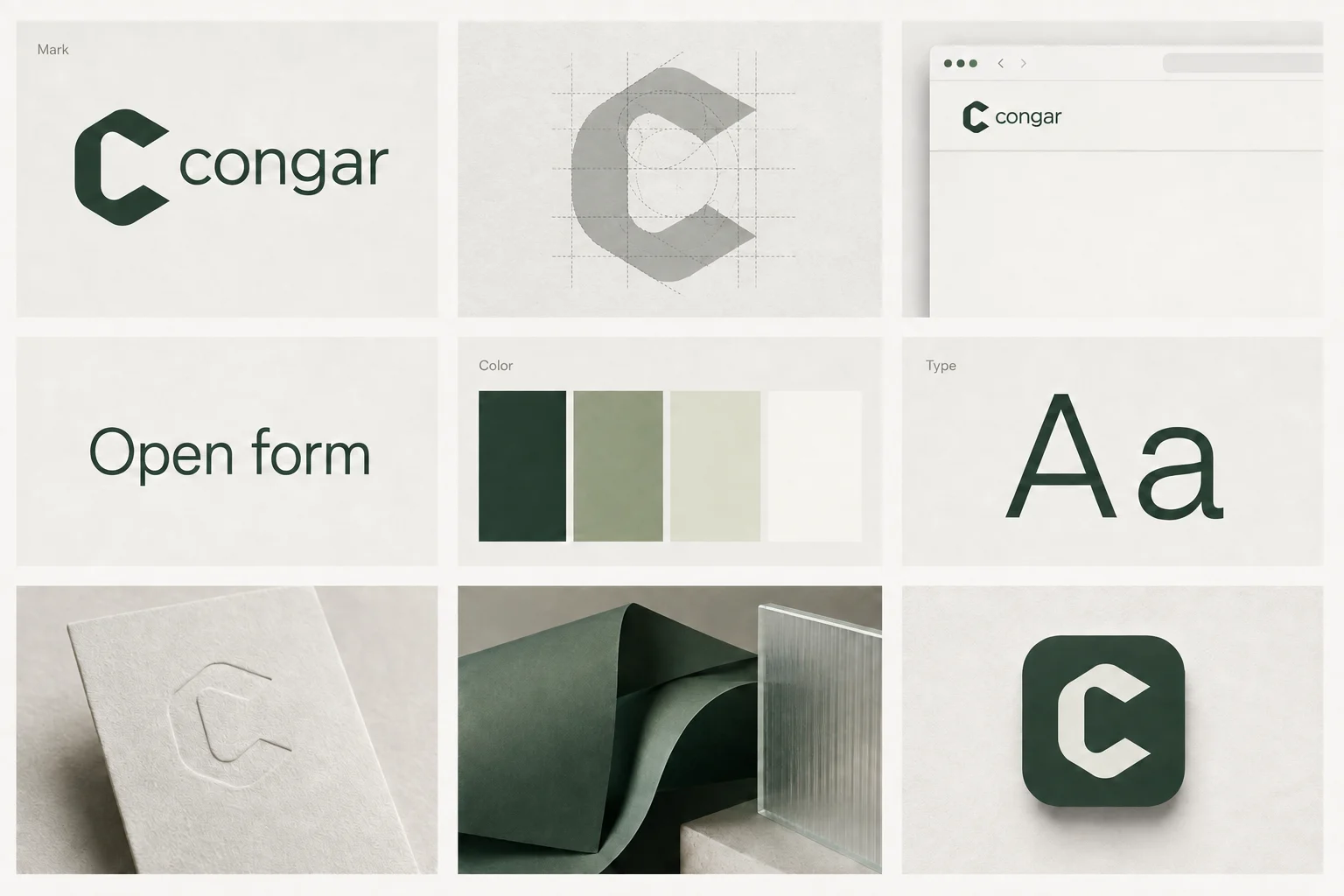
Use Ink for headings, Text for supporting copy, and Action for controls with Paper text. Pale can separate a study or product surface. Sage supports illustration and accents; check contrast before using it for text. Keep hover states in this palette. Do not introduce orange hover treatments.
Keep the voice recognizable
Use Archivo at normal 100% width for headings and reading. Its full weight range is available. Reserve Caveat 500 for short handwritten annotations, and IBM Plex Mono for code or small technical labels. Keep body copy direct, specific, and comfortable to read.
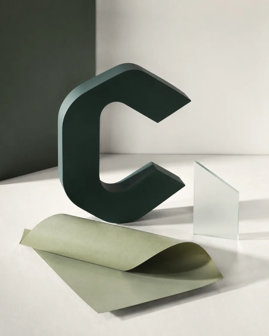
Use the supplied open C without stretching, clipping, or adding effects that obscure its shape. Give it clear space. Illustrations should explain the subject: paper, glass, and solid green forms can make an idea visible. Article imagery must relate to the article, not repeat a generic brand picture.
Make motion useful
Keyboard focus uses an ink frame, a paper gap, and a sage halo. The frame settles into place over 240 ms and remains visible until focus moves. Keep the same clear indicator with motion disabled.
Animate feedback, relationships, and changes of state. Begin with 160–240 ms transitions and small movements; adjust to the interaction. Prefer transform and opacity. Avoid continuous decoration, blocking page transitions, and surprise movement. Touch and keyboard users must receive equivalent feedback.
Respect prefers-reduced-motion with immediate state changes or a brief fade. Keep essential content visible before hydration and without animation. Use semantic elements, visible focus, descriptive labels, and tested contrast. Prevent horizontal page overflow, including long links, code, and animated elements.
Check the result
Test real routes on mobile and desktop, keyboard navigation, reduced motion, loading states, and browser history. Aim above 90 in Lighthouse performance, accessibility, best practices, and SEO; measure each page template. Scores are targets, not guarantees or a substitute for manual checks.
Give indexable pages useful titles, canonical URLs, and their own sharing image. Optimize image sizes and font loading. Keep the accompanying font licenses when redistributing fonts.
Use the actual assets.
Keep the mark's proportions and include the font licenses when distributing font files.

Bring the type with you.
Download these fonts and their licenses into your project. Serve them at the paths below before using the CSS starting values.
CSS starting values
/* Download the linked fonts and licenses from https://www.congar.dev/design/guide. Serve font files at the local paths below. */

@font-face {
  font-family: 'Archivo';
  src: url('/fonts/archivo.woff2') format('woff2');
  font-style: normal;
  font-weight: 100 900;
  font-stretch: normal;
  font-display: swap;
}

@font-face {
  font-family: 'Caveat';
  src: url('/fonts/caveat.woff2') format('woff2');
  font-style: normal;
  font-weight: 500;
  font-stretch: normal;
  font-display: swap;
}

@font-face {
  font-family: 'IBM Plex Mono';
  src: url('/fonts/ibm-plex-mono.woff2') format('woff2');
  font-style: normal;
  font-weight: 400;
  font-stretch: normal;
  font-display: swap;
}

:root {
  --congar-ink: #17231f;
  --congar-action: #263e33;
  --congar-sage: #839779;
  --congar-pale: #e0e6d4;
  --congar-paper: #f6f7f2;
  --congar-text: #53604f;
  --congar-font: 'Archivo', sans-serif;
  --congar-annotation: 'Caveat', cursive;
  --congar-code: 'IBM Plex Mono', monospace;
  --congar-motion-fast: 160ms;
  --congar-motion-default: 240ms;
  --congar-easing: cubic-bezier(0.22, 1, 0.36, 1);
}

@media (prefers-reduced-motion: reduce) {
  :root {
    --congar-motion-fast: 0ms;
    --congar-motion-default: 0ms;
  }
}
Read the complete project brief
# Congar identity guide

Mohammed Abdelhady · Senior Software Engineer

A practical reference for carrying the Congar identity into a new project: clear typography, paper surfaces, deep green actions, and motion that explains what changed.

## Start with the product

Use this guide when building a project for Mohammed Abdelhady. Congar is his personal identity; Open Form is its open C mark. Keep the product’s own purpose, name, and audience clear. A tool can belong to this family without becoming a personal homepage.

Use the new project’s own name and content. Keep Mohammed’s biography on his personal pages. Describe only verified work; never invent experience, clients, metrics, or availability.

## Give the content room

Build the hierarchy around a useful action and understandable content. Use generous margins, deliberate alignment, and restrained separators. Give headings, reading text, and supporting notes distinct roles. Compose small screens deliberately; do not shrink a desktop canvas.

Use Ink for headings, Text for supporting copy, and Action for controls with Paper text. Pale can separate a study or product surface. Sage supports illustration and accents; check contrast before using it for text. Keep hover states in this palette. Do not introduce orange hover treatments.

## Keep the voice recognizable

Use Archivo at normal 100% width for headings and reading. Its full weight range is available. Reserve Caveat 500 for short handwritten annotations, and IBM Plex Mono for code or small technical labels. Keep body copy direct, specific, and comfortable to read.

Use the supplied open C without stretching, clipping, or adding effects that obscure its shape. Give it clear space. Illustrations should explain the subject: paper, glass, and solid green forms can make an idea visible. Article imagery must relate to the article, not repeat a generic brand picture.

## Make motion useful

Keyboard focus uses an ink frame, a paper gap, and a sage halo. The frame settles into place over 240 ms and remains visible until focus moves. Keep the same clear indicator with motion disabled.

Animate feedback, relationships, and changes of state. Begin with 160–240 ms transitions and small movements; adjust to the interaction. Prefer transform and opacity. Avoid continuous decoration, blocking page transitions, and surprise movement. Touch and keyboard users must receive equivalent feedback.

Respect prefers-reduced-motion with immediate state changes or a brief fade. Keep essential content visible before hydration and without animation. Use semantic elements, visible focus, descriptive labels, and tested contrast. Prevent horizontal page overflow, including long links, code, and animated elements.

## Check the result

Test real routes on mobile and desktop, keyboard navigation, reduced motion, loading states, and browser history. Aim above 90 in Lighthouse performance, accessibility, best practices, and SEO; measure each page template. Scores are targets, not guarantees or a substitute for manual checks.

Give indexable pages useful titles, canonical URLs, and their own sharing image. Optimize image sizes and font loading. Keep the accompanying font licenses when redistributing fonts.

## Palette

- Ink: `#17231f`
- Action: `#263e33`
- Sage: `#839779`
- Pale: `#e0e6d4`
- Paper: `#f6f7f2`
- Text: `#53604f`

## Fonts and assets

Download the fonts and their licenses into your project. Serve each font at the local path shown below; the CSS starting values use these paths.

- [Archivo 100 900](https://www.congar.dev/fonts/taste-lab/archivo-latin-wght-normal.woff2) → /fonts/archivo.woff2 · [license](https://www.congar.dev/fonts/taste-lab/archivo-LICENSE.txt)
- [Caveat 500](https://www.congar.dev/fonts/handwriting/caveat-latin-500.woff2) → /fonts/caveat.woff2 · [license](https://www.congar.dev/fonts/handwriting/caveat-LICENSE.txt)
- [IBM Plex Mono 400](https://www.congar.dev/fonts/taste-lab/ibm-plex-mono-latin-400-normal.woff2) → /fonts/ibm-plex-mono.woff2 · [license](https://www.congar.dev/fonts/taste-lab/ibm-plex-mono-LICENSE.txt)
- [Open Form mark](https://www.congar.dev/brand/congar-mark-512.png)
- [Open Form illustration](https://www.congar.dev/brand/open-form.webp)
- [Identity board](https://www.congar.dev/brand/identity-board.webp)

[Visual guide](https://www.congar.dev/design/guide) · [JSON tokens](https://www.congar.dev/design/tokens.json)